Digital Twin Ocean: Real-Time Reef Management with AI
Digital Twin Ocean: Real-Time Reef Management with AI https://pharosproject.eu/wp-content/uploads/2026/04/nemo-491knx7Ss_s-unsplash-1024x576.jpg 1024 576 PHAROS Project https://pharosproject.eu/wp-content/uploads/2026/04/nemo-491knx7Ss_s-unsplash-1024x576.jpgWhat actually is a Digital Twin Ocean?
It’s a virtual copy of a real marine ecosystem that stays synchronised with its physical twin through continuous data flows. Unlike a static map or a one‑off report, this thing lives and breathes with the ocean. It’s never out of date.
You are a marine protected area manager. You get an alert: water temperatures near your artificial reef have shot up three degrees above normal. What do you do? Wait for next month’s report? Send a dive team out next week? By then, the fish might be gone or the coral bleached.
Live temperature data streams from sensors on the reef. An AI model shows you the next 72 hours. You run a quick “what if” scenario: if this heatwave keeps going, how will oxygen levels change? Within minutes, you decide to adjust fishing restrictions and ping local fish farmers.
A DTO has four essential layers. Let us walk you through them, because each one matters.
First, the Observing System
This is the real‑world kit: sensors, cameras, hydrophones, eDNA samplers. In the PHAROS project, that means temperature probes, underwater microphones listening for dolphins or boat noise, and even automatic DNA collectors that sniff out invasive salmon. Without this layer, you’re guessing. Data has to come from somewhere real.
Second, the Data Space
All that raw information needs a home; organised, cleaned, and ready to use. PHAROS uses a cloud‑based data lake, linked into EMODnet (that’s Europe’s marine data network). Think of it as a massive, tidy library instead of a messy garage. You don’t want to spend hours hunting for last week’s oxygen readings.
Third, the Analytics Engine
This is where models and AI do their magic. Not magic exactly, but maths and machine learning. PHAROS uses self‑learning surrogate models (fast approximations of ocean physics) and acoustic classifiers that recognise fish noises. The engine predicts what happens next, not just what already happened.
Fourth, the Interactive Layer
Dashboards, map viewers, scenario testing tools. This is where the manager, the scientist, the curious local actually get to ask questions. Click on a reef, see live oxygen levels, run a forecast. The interface hides all the messy code underneath.
Now here’s the thing the DTO does not do. It doesn’t replace human decision‑making. That’s crucial. What it does is make decisions faster, smarter, and more transparent. Because everyone sees the same live data and the same evidence‑based forecasts. No arguing about whose report is right.
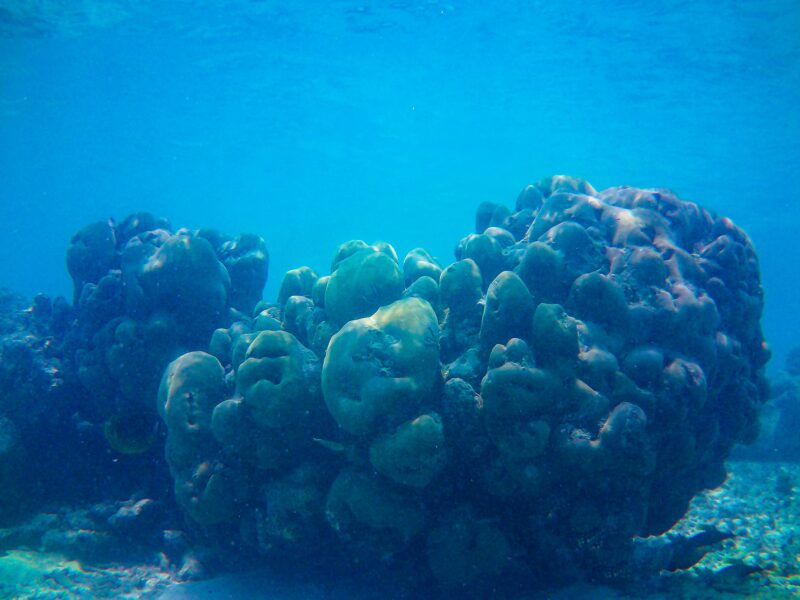
PHAROS, an EU‑funded project is creating a live digital copy of two very different marine environments: the nutrient‑rich waters off Gran Canaria and the salmon rivers of Iceland. Led by a company called blueOASIS (Portuguese, clever people), the DTO streams data from seabed to cloud, runs AI models, and puts everything on an easy dashboard. The goal is simple: give marine managers, scientists, and local communities the power to see, understand, and respond to changes before problems become irreversible.
Why go through all this trouble? Because the European Union has a hard target: restore ocean health by 2030. But restoration isn’t just dropping concrete blocks into the sea. It needs continuous, interoperable, open data that works across borders and time zones. PHAROS designed its strategy around three core ideas.
Bridge the mission phases. The EU Mission Ocean has two phases: development by 2025, then deployment from 2026 to 2030. PHAROS sits right in between. The DTO built in Gran Canaria and Iceland isn’t a one‑off experiment. It’s a blueprint that other Atlantic and Arctic regions can copy.
FAIR from the start. Too many projects collect excellent data that nobody can find or reuse. FAIR means Findable, Accessible, Interoperable, Reusable. PHAROS committed to that on day one. Every dataset (from nutrient sensors to eDNA samples) uses the same metadata standards, the same vocabularies, and gets published through EMODnet and the European Digital Twin Ocean platform (EDITO).
Adaptive management. The DTO isn’t a final report you file away. It’s a continuous loop. Sensors feed data into models, models generate predictions, you take action, action changes the real ocean. New data confirms whether the action worked. Then the loop begins again. That’s adaptive management at scale. As Giacomo Dieci from blueOASIS puts it: “The DTO turns months of waiting into minutes of insight.”
Alright, how do you actually build one of these things? PHAROS follows a careful workflow:
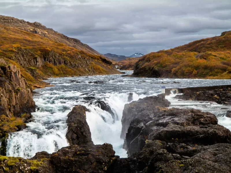
Layer 1: In Situ Sensors – the eyes and ears. Before you model the ocean, you measure it. PHAROS deploys a network across the demonstration sites. Oceanographic sensors measure temperature, salinity, dissolved oxygen, currents, waves, nutrients. Acoustic hydrophones (the Hydrotwin system) listen for marine mammals, fish sounds, vessel noise. Underwater cameras (SmartFISHER) record fish presence and reef colonisation. And eDNA samplers automatically detect invasive pink salmon in Icelandic rivers. These instruments stream data in real time or near real time – some every five minutes, others daily. If telemetry fails, they store data locally and sync later.
Layer 2: Data Ingestion and Harmonisation. Raw data arrives in a mess of formats: NetCDF from ocean models, WAV files from hydrophones, JPEG images, CSV tables. The DTO’s ETL pipelines (Extract, Transform, Load) convert everything into standard formats: NetCDF for gridded data, CSV and JSON for time series, MP4 and JPEG for visuals. And metadata – the data about data – gets recorded too. Who collected it? Which sensor? Calibration date? Quality checks? That stuff matters.
Layer 3: The Data Space – storage and access. All harmonised data lives in a hybrid cloud system managed through EDITO. Three tiers: raw (original, unprocessed), processed (cleaned, validated), and DTO‑ready (aggregated, model‑compatible). Backups weekly. Versioning enabled for every file. Role‑based access control keeps sensitive data (like real‑time locations of protected species) visible only to authorised users.
Layer 4: Analytics and Prediction Engine. This is where the DTO gets smart. Three complementary modelling approaches. First, numerical models – MOHID for hydrodynamics and biogeochemistry, WW3 for waves, RAINDROP for underwater acoustics. These simulate physics from first principles. Second, AI‑driven detection models – Hydrotwin for acoustic classification, SmartFISHER for visual species ID. They’re pre‑trained on huge datasets and continuously fine‑tuned. Third, surrogate models – neural networks trained on sensor time series. They’re fast, lightweight approximations that run in seconds instead of hours. Perfect for real‑time forecasting. Then data assimilation (Ensemble Optimal Interpolation) combines sensor measurements with model outputs to correct biases.
Layer 5: Interactive Provisioning Layer. All that complexity hides behind a clean dashboard. Users can view live sensor data on a map – temperature, currents, oxygen, nutrients. See AI‑detected species richness over time. Run “what if” scenarios: what if current direction changes? What if a marine heatwave arrives? Download data via REST APIs. The dashboard connects directly to the EDITO platform, so PHAROS contributes to the wider European Digital Twin Ocean ecosystem.
Building a DTO isn’t instant. PHAROS follows four phases.
Phase 1. Getting the foundation right (March 2025 – February 2026):
This happens from March 2025 to February 2026. What are we doing? Building the invisible skeleton. Before any sensor touches water, you need the mathematical models that understand Gran Canaria’s currents versus Iceland’s rivers. They’re totally different places. So the team develops numerical models for each site. Then they standardise those models into Docker containers, think of containers as little self‑contained boxes that can run anywhere, on any computer, without fighting with other software. They also set up cloud storage and design the data pipelines. The purpose here is simple: make sure when real data starts flowing, there’s a place for it to go and a brain ready to understand it. No point installing a fancy sensor if the backend is a mess.
- Infrastructure setup.
- Develop numerical models for Gran Canaria and Iceland.
- Standardise them into Docker containers.
- Set up cloud storage and data harmonisation.
- Design end‑to‑end pipelines.
Phase 2. Getting our hands wet (August 2025 – August 2026):
his overlaps with Phase 1 because you don’t wait for one to finish before starting the next. Now the team actually goes out on boats. They deploy hydrophones (underwater microphones), cameras, nutrient sensors, spotter buoys, current meters. In Iceland they install that clever eDNA sampler that sniffs for invasive pink salmon. Then they calibrate everything. Calibration is boring but vital. You don’t want a temperature sensor that reads two degrees high – that’s the difference between “normal” and “panic”. So they compare each sensor against known standards, adjust, test, adjust again. The purpose of this phase is to get reliable eyes and ears into the water. Real data starts arriving, but not yet in real time.
- Sensor deployment and calibration.
- Deploy hydrophones, cameras, nutrient sensors, spotter buoys, current meters. Install the eDNA sampler in Iceland.
- Calibrate everything.
Phase 3. Making it live(February 2026 – December 2026):
This is where the magic switches on. They activate real‑time transmission – using 4G, satellite, IoT networks. Suddenly those sensors aren’t just logging data to internal memory. They’re shouting it to the cloud every few minutes. The team validates the whole data flow: does the sensor reading actually appear on the dashboard? Does it arrive corrupted? How long does it take? They also cross‑calibrate sensor measurements with numerical models. That means checking: does the real‑world temperature match what the model predicted? If not, you tweak the model. The purpose here is to close the loop. You stop guessing and start seeing. For the first time, a manager could open a laptop and see live oxygen levels on their artificial reef.
- Data streaming activation.
- Activate real‑time transmission (4G, satellite, IoT).
- Validate the whole data flow.
- Cross‑calibrate sensor measurements with numerical models.
Phase 4. Teaching the AI to think (August 2026 – February 2027):
August 2026 to February 2027. Now you have months of live data. That’s the training ground. The team trains surrogate models – these are lightweight AI networks that learn from the real data and can forecast faster than physics‑based models. They test data assimilation schemes, which is a fancy way of saying “how do we blend real measurements with model predictions to get the best guess of reality?” They validate predictions against new incoming measurements. And finally they run “what if” scenarios. What if a heatwave hits? What if a ship anchors on the reef? The purpose of this phase is to turn raw data into foresight. Not just “what is happening” but “what will happen next”.
- AI model training and validation.
- Train surrogate models on collected data.
- Test data assimilation schemes.
- Validate predictions against real measurements.
- Run “what if” scenarios.
Then February 2027 arrives: The DTO goes fully operational, live, real‑time. From that day on, anyone with access can see, forecast, and act. No more monthly reports that arrive too late.
What happens after February 2027? The DTO keeps running for the remaining 30 months of the project. Sensors keep streaming. Models keep learning. Stakeholders keep using the dashboard. Those final 30 months aren’t about building – they’re about operating, refining, and replicating.
And how does the DTO connect to the rest of PHAROS? It sits at the heart, both receiving data from and delivering insights to nearly every major component. Here are some concrete examples that we want to share with you:
In Gran Canaria (IMTA and reef restoration), the DTO gets continuous sensor data (temperature, oxygen, nutrients, currents), acoustic recordings, underwater video, and manual biomass samples. In return, it provides a dashboard showing nutrient uptake, fish growth, and reef colonisation in near real time.
The same site also hosts a marine forest and artificial reef. Here the DTO receives sensor data from upstream and downstream zones, AI‑classified species counts, and reef integrity inspections. It sends back predictions of macroalgae yield and biodiversity gain under different current and temperature scenarios.
In Ireland (salmon farm and macroalgae co‑location), data is more periodic: monthly seaweed growth measurements, water chemistry samples, biodiversity surveys. The DTO provides periodic updates on nutrient reduction and carbon sequestration, plus offline model runs.
In Iceland (invasive pink salmon monitoring), it’s real‑time eDNA detection from the Environmental Sample Processor, underwater camera footage, and acoustic seal detection. The DTO gives early warning alerts when pink salmon eDNA exceeds thresholds, triggering culling recommendations.
Who makes all this happen?
PHAROS consortium. blueOASIS leads the technical development – the Portuguese SME that builds the DTO architecture, the AI models (Hydrotwin and SmartFISHER), deploys the sensors, manages data pipelines, and creates the dashboards. But every partner contributes data, expertise, or infrastructure.
A Digital Twin Ocean sensors bolted to reefs, data flowing through pipelines, models learning from the past and guessing the future, and a dashboard that puts the power in your hands. It won’t replace you. But it will make you faster, smarter, and a lot less likely to say “if only we’d known sooner.”