MINKA Session: From Citizen Observations to Publishable Research and Actionable Evidence
MINKA Session: From Citizen Observations to Publishable Research and Actionable Evidence https://pharosproject.eu/wp-content/uploads/2026/02/MINKA-Session-Featured-1024x455.webp 1024 455 PHAROS Project https://pharosproject.eu/wp-content/uploads/2026/02/MINKA-Session-Featured-1024x455.webpDiscover how MINKA’s citizen-generated data can strengthen academic research and support evidence-based ecosystem management for public administrations and policy-makers.
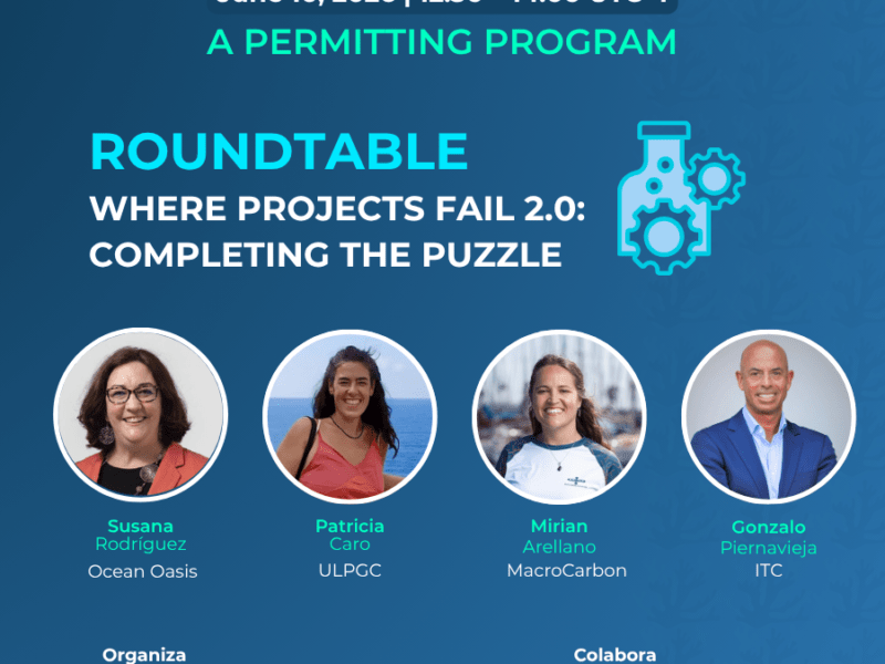
This session was part of MarCoLab Gran Canaria, PHAROS’s Living Lab in the Canary Islands: a blue economy innovation and co-creation space that brings together research, public authorities, businesses, and communities to test, learn from, and scale solutions for healthier marine ecosystems. The session was organised on Friday, 30 January 2026 (PHAROS Mega Event, Gran Canaria) at Clúster Marítimo de Canarias in Gran Canaria.
Through concrete success stories, the session highlighted how Living Lab-generated citizen science data can be reused for rigorous academic research and transformed into knowledge to support evidence-based ecosystem management. Speaker Jaume Piera, the leader of the EMBIMOS research group at ICM-CSIC and the founder and coordinator of MINKA citizen science infrastructure, guided participants through practical, successful examples of how to use MINKA data for research and real-world impact.
Citizen Science and Environmental Monitoring
Introduction to Global Challenges
Global challenges are addressed first. Although it may seem distant, the COVID-19 pandemic was not that long ago. COVID was a very significant social problem that restricted society and presented numerous issues. While it appears this period has passed, other emerging problems are considered by some to be equally important, or in some cases even more challenging: aspects such as recession, climate change, and the collapse of biodiversity.
Climate Change and Biodiversity Loss
Global Warming Predictions
Several studies present the problems that may be faced, one of the major issues being global warming. Some models predict that if the use of fossil fuels and the production of greenhouse gases continue at current rates, temperatures will rise significantly. Temperature levels and increases will be reached that will cause many difficulties, representing an important change. Others predict that if the production of these gases can be significantly reduced, the growth that has occurred in recent years can at least be stabilised. It should be noted that this change implies a very important social shift regarding the use of fossil fuels. Reducing fossil fuels represents a major social change, and not everyone is willing to accept or face this.
Biodiversity Decline
The same situation applies to biodiversity loss; a process of quite significant decline is currently underway. Three major possibilities are identified here:
- Continuing as at present, it is predicted that a downward trend will continue until very low levels are reached.
- Commencing corrections in terms of conservation.
- If recovery is truly desired, the way food is produced and consumption patterns must be significantly changed, which represents a very significant change from economic and social perspectives.
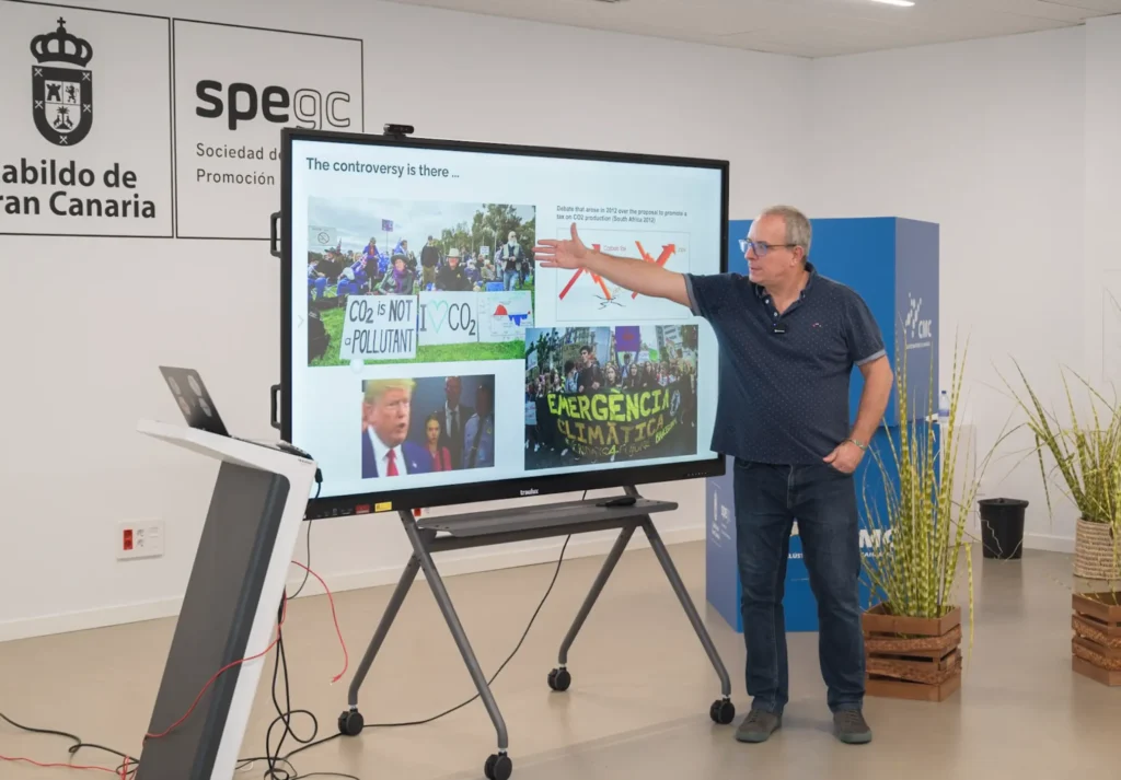
The Controversy
Significant controversy exists. Familiar figures are often associated with this, as there are more radical ways of viewing the problem. This means that some individuals claim that CO₂ is not a pollutant, while others state that a climate emergency exists. A diversity of opinions is found within society, which enters into the context of “wicked problems,” where people experience the same problem in radically different ways. This must be lived with because there are people who make decisions. These individuals have a great capacity to make very important decisions that affect not only their country but the global environment.
Academic Controversy
Faced with these types of controversies, it is found that even within the academic world, very controversial points are raised. For example, a Nobel Prize winner in Physics, awarded for particle physics studies, defends the position that this entire climate crisis is pure fiction. This poses problems because a Nobel Prize winner may lack instruction in climate sciences; in any case, the controversy persists and these types of problems are observed.
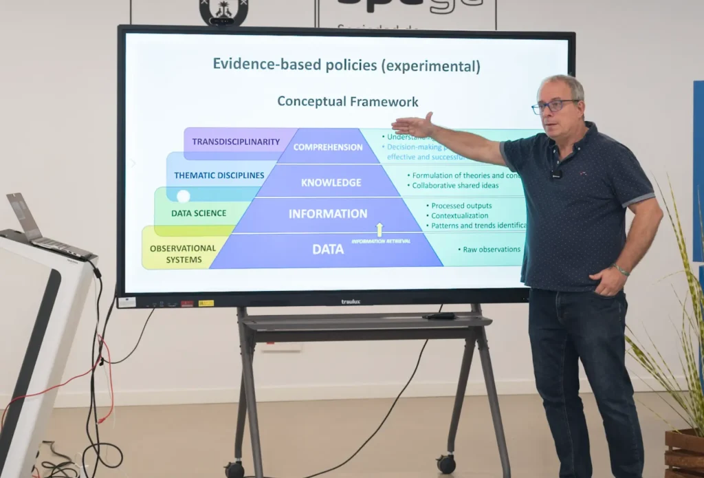
Evidence-Based Policy
The adoption of evidence-based policies has been proposed for a long time. Often, decisions are made more from the gut than from the head. For them to come from the head, reliable data is needed that allows those evidences to be taken, based on having extracted information from objective data. Of course, this poses a challenge when the goal is to work on evidence. Data must be taken that provides information about what is happening, and based on that, decisions are made. This is not as simple as it first appears.
Data Collection Framework
A general scheme frequently used is as follows: observational systems allow for the acquisition of data. From these data, information is extracted. This information is normally organised with data science (which was formerly called statistics, but now goes a bit further), which is basically the processing of these data to obtain patterns. These patterns can indicate whether progress is positive or negative. This allows for the formulation of hypotheses, such as decision-making proposals. If the phenomenon being studied is capable of being understood, such as climate change (and the discussion about whether climate change is real or not), and if all this has been done correctly, the conclusion can be reached that there is effectively a climate problem and therefore a series of decisions must be made. Focus is placed on a very specific context: the challenges that obtaining these data poses.
The Challenge of Data Collection
Spatial Resolution
An attempt is made to justify what problem can exist between obtaining data and extracting information, specifically to what extent different ways of taking data can bias the information obtained and therefore generate controversy at higher scales, which are normally the ones of greatest interest: understanding and decision-making. To do this, cases in two dimensions are examined. A phenomenon in a territory must be studied, and data on this phenomenon is taken. The problem is: how much data is taken in that territory to make the decision? One way is to discretise the territory into various cells and obtain observations on those cells. But it is noted that if the number of cells is increased, it can be wondered: if the sample is taken here, is this sample representative of everything that is happening here? Obviously, the smaller the cell, the more representative the growth of its cell, but the number of cells from which to obtain data increases, and that can be a very serious problem.
Example: Bird Species Monitoring
An example is provided. Imagine birds are being observed and species are to be identified. At each point, what is desired is to know how many bird species there are. There is a well-known curve called the “effort curve”. The more time spent observing, the more the number of species seen will probably increase. At first, progress is very fast, and then to keep increasing, much more time is needed. These curves are very typical and occur with birds, frogs, or anything else; they occur in everything. Therefore, a certain amount of time must be dedicated so that the measurement is representative of what really exists.
Practical Exercise
An exercise is supposed: work is done with high resolution (109 cells), and in each one, species are to be seen. If a formula is taken and it is supposed that 30 days are dedicated, a reasonable number close to the maximum is reached. Well, 109 cells at 30 days equals 3,270 days to cover the entire territory, more or less. That is close to 9 years. If decisions are to be made, it takes 9 years just to take the data. This is especially true when thinking about changes, such as whether species are being lost in this territory.
Data Interpretation Challenges
Something more realistic is supposed. Imagine for each effect, this has been explored and it has given results. This species has been detected at some points marked in red; in others, enough time has been dedicated to almost ensure it is not there (blue); and in grey, some have been left where it is not known what is happening because many times the entire territory could not be covered. Therefore, there are areas of certainty (because it was seen), areas where it is estimated to be almost certainly absent, and some cases where there is insufficient information. If this exercise were repeated after some time, a case like this could occur where there are many more cells in blue. This means that in this territory, this particular species has decreased. This could be good news if it is an invasive species, meaning the rehabilitation plan is working. It could be bad news if it is a sensitive species in a conservation programme, meaning the conservation programme is not working because territory is being lost. But what happens if instead of doing this with 109 cells, it had been done with many fewer? With many fewer, this probably would not have been known. It is noted that two problems exist here:
- By taking only one data point in each cell and marking them red, the impression is given that this species is practically throughout the territory when it was not quite true.
- What is also worrying is that when the next period is reached, the same thing is seen, so it is said nothing has happened here; but yes, something has happened, there just was not enough information.
The loss of information can have consequences in terms of whether it is an eradication plan or conservation plan. In a conservation plan, it would be said that progress is good because nothing happened here, or in an eradication plan, it would be said that progress is bad when it was not so bad because the species has been reduced in some areas.
Coastal Monitoring Example
Another example: instead of a menu, suppose there is a coastal monitor. Ideally, imagine all these cells are taken and data from all the cells is desired. It is done with a system that gives high precision and accuracy. Suppose what was measured here had a pattern like this; this would be the result of having all the measurements very well done, all the stations. But in practice, this is not viable; nobody is monitoring the entire coast. What is most common is to take several points from the coast, take them very well, and from these data try to infer or extract information about what is happening on the coast. This is very common, known as station data. Another slightly different approach is to try to convince people to help and give data from all stations. But this has a price; if many people are involved, some will do it well, others will not do it as well, and noise is generated. The dilemma is: which of the two approaches is better? Or can it be thought that this is a reference, and this will give worse solutions?
Temporal Sampling
Survey on Sampling Frequency
An initial survey was done in another project where many people said: well, this will depend on the purpose for which this observation is measured. A whole set of researchers was asked what they considered the temporal rate should be in three different scenarios:
- Sampling to comply with environmental regulations.
- Operational sampling, performed regularly.
- Capturing all variability in the system.
Results
The results obtained were more or less as follows:
- For sampling systems to comply with environmental regulations, seasonal sampling was already sufficiently good. The vast majority thought it was quite good to take one in spring, another in summer, and another in autumn.
- The majority of people sample monthly.
- If all variability must be captured, then it is necessary to go weekly, daily, or even hourly.
There is quite a consensus. It is questioned whether this is more or less okay, or if a difference in the problem is seen. It depends on the species, but it also depends on the system dynamics.
Light Variation Experiment
This is not analysed sufficiently well, but an experiment is going to be done in a very particular case, as it is a numerical experiment. It concerns a phenomenon that is very familiar: how light varies throughout the year.
The Data
These data are not real; they are simulated data, but they closely resemble reality. There are 700,000 data points. Over 11 years, data has been taken on what the light was per day. Imagine a photometer or a radiometer was used, giving exactly the light value or irradiance. This radiometer gives exactly how many watts per square metre, and every 15 minutes a data point is able to be taken.
Observations
At first, this series may be very familiar; each dome represents a day. If a zoom is then performed, the data begins to be seen. It can be seen where the peak is; in summer there is more light, and in winter much less. If zoomed in more, it is seen that this also has a 24-hour cycle: day, then midday, down at night, back up at midday. Both winter midday and summer midday are known to be 24 hours. It is supposed nobody disagrees with this, and it is also known that if the cycles in each dome were counted, 365.25 cycles per year should be obtained. The year has 365 days.
The Experiment
An experiment is now performed. Since so many data points are available, an attempt is made to reduce the data a bit and see what comes out. It is done in a context that most scientists said was more than sufficient, which is called sub-daily resolution. That is, there are more than 365 measurements each year. In environmental themes, for environmental monitoring, saying you are going to take more than 365 per year is a lot. Daily is normal; people say weekly is sufficient enough. Here, it is not weekly; something more than 1,000 is used.
Three cases are performed, all taken between day and hour, where one is the reference and the others are selections:
- One case: 417 samples per year are taken.
- Another: 394 samples.
- Another: 373 samples.
That seems like a lot, but a pattern emerges. Right away, it is seen something is wrong, because if it is said “I went somewhere and measured and got 8 day-night light cycles per year,” it would be said: but there is no place on Earth that has 8 light cycles per year. None. It also does not have 29, because in this case 29 come out, and here 52 come out. It is not just this; this can be done for three consecutive years, and for three consecutive years it gives 52, 52, 52… 29, 29, 29… 8, 8, 8… For 10 years it would also come out the same. Artifactual patterns are emerging. This is well known, but people do not have it in mind.
But if only these data were available, it should be noted that more than 1,200 data points were taken in 3 years. In any case, more than 1,000 data points have been taken in 3 years. If it is said: I went on a project for 3 years, I took more than 1,000 data points at each station, and also with zero error; it would be said that it is perfect for extracting super good information. Well, it can already clearly be seen that it is not going to be extracted, because something totally wrong is going to be extracted. It is the same poorly sampled series in three different cases. But in all three cases, it is clear it is giving erroneous information because it is stating that in one place there are 52 cycles, in another 29, and in another 8. If only these data were available, it is not thought anyone would reach the conclusion that the Earth revolves around the Sun, rotates every 24 hours, and makes these rotations 365.25 times each time it goes around the Sun. With these data here, it is not thought anyone does it.
It is noted it is a relatively simple thing. Now it is said: the more complicated the phenomenon, the more data is needed. Therefore, think about how many natural phenomena are being tracked now that are being monitored far below this, and phenomena like this can be encountered. Well, it is said the vast majority, because the vast majority need more data than this, and it is not being done. And that is a problem, because that generates more uncertainty.
The Aliasing Effect
What is being explained is not really discovering the wheel for many people, because all these gentlemen theoretically considered all this. The first was Edmund Whittaker in 1915, on how interpolation should be done. Therefore, this concerns more than 100 years. Most of these gentlemen worked with digitisation and created and encountered a phenomenon known as the aliasing effect: if few data points are taken and the original (the green one) is reconstructed, it can be perfectly reconstructed with another that in some cases has nothing to do with it, because it is noted that, for example, here there is a local maximum, and it is reconstructed with a local minimum. This phenomenon is known and very well understood and has been applied throughout the digitisation system that works well. This is known because now there is digital music, digital telephony, digital TV; in all cases they have applied this.
CD Music Example
To give an idea: when music went to CD, the decision had to be made about how many samples to take per second. It is wondered how many would be interesting. 5,000 samples per second? That would be good. Well, 5,000 is not bad, every second… no idea. But it is noted that the CD is listened to, and it is listened to very well. The CD needs a minimum of 40,000 samples per second, and for a technical reason, it is a bit more: 42,000 or 41,400 samples per second. Translated to bits, that is 1 million bits per second. In a CD, for each second of music, 1 million little holes are stored. Imagine the complexity involved. But they had to do it, and it meant, from an engineering perspective, a headache. It is certain some have young children who have sometimes used CDs. The CD is stained, full of grease, they have put 1,000 things on it, and even so, storing 1 million little holes for each second of music, it is listened to quite well. It has to be hit very hard for it to finally skip. The music would not have been heard well if they had not done that control. The same happens somewhat intellectually; a huge amount of bits per second and very high information flows are being discussed. In nature, it can be found that information flows not as “beastly” will be needed, but still much higher than what is habitually used. Many times weekly is perfect for us, but it is said that for the majority of natural phenomena, the problems seen in the sun example will be encountered.
The Need for More Data
Therefore, it is noted that all this long explanation comes from a very simple phrase: many more data are needed at all times and everywhere, because there are spatial problems and temporal problems. Two options to address this problem are available:
- Increasing observation technologies: drones, artificial intelligence, and so on.
- Involving people: who is at all times in all places? People.
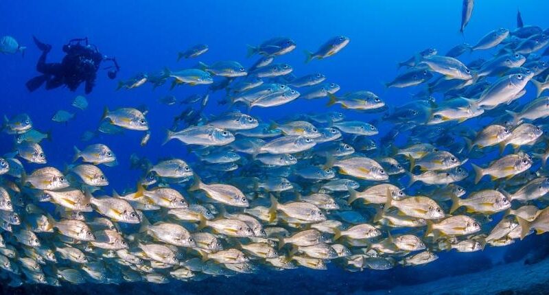
People are doing sports activities, work, artisanal fishing, and more. If people can be involved, perhaps this problem can be addressed and these volumes of information accessed. And this basically justifies to a good extent the use of citizen science.
Citizen Science Approaches
It is noted that basically, remember there were these two possibilities. If reconstruction is done here, it is noted that when reconstructing, this aliasing phenomenon happens where in some areas the error can be enormous. On the other hand, when participatory data is worked with, if there are many (and this is important, if there are many), very probably the way it can be obtained resembles this. The blue that has been obtained from here can closely resemble this. The only problem is that sometimes there can be certain bias or certain ways that people provide biased data. Therefore, it is noted that the good thing is: these are combined with those, the bias is explained, and this is kept, which is the best approximation that could probably be had of the phenomenon to be studied. This probably implies: academics do this, citizens do this, and academics are then concerned with identifying if there are biases or problems. With this, data fusion is somehow then done, which allows for reaching what most resembles the phenomenon that can be studied. From there, the desired information can be extracted from that extracted information into decisions, or the phenomenon can be understood, which is ultimately what academics want to do.
Two Main Approaches
There are several ways. There is the classic way of exploring territory. It has been seen that sometimes having these gaps is complicated. In some cases, or especially at the beginning, what was thought was more to make people act as researchers; they are trained, it is explained to them how they should measure, and then okay, here are the academics, and all this seen in green would be people who voluntarily went through a training process, were given protocols, were even given some measurements, and they obtain data. This is good and in some cases has worked very well, and some examples will be seen. But there is another way that is totally unstructured; letting people flow and do and take what they can when they want. It is a more complex form because it generates more noise, but it very probably allows for covering what cannot be covered here, because here filtering is occurring; only those people who are willing to be trained and follow academic protocols are included. It is known that most academic protocols are boring; you have to go every 7 days, measure this way, and it has to be 7 days, etc. Many people say, hey, no, not me. Give me some freedom; one day I go and take some photos, another day I am 2 months without doing anything. It is easier to get many more people involved here. It is more complicated, but sometimes it is achieved.
MINKA Platform Overview
MINKA, a publicly funded platform inspired by iNaturalist but focused on data governance to avoid private control issues like those with Twitter, enables collaborative species identification via photos, GPS, and community voting. Named after the Quechua term for collective community work, it targets UN Sustainable Development Goals, particularly biodiversity indicators, with yellow-highlighted potentials for expansion.
It features a four-community model (academics, citizens, facilitators, and mobilizers) deployed in Living Labs for local-global interactions via the “Janus model,” supporting short-term citizen engagements in local languages and long-term academic outputs in English. Research teams plug in through project creation, data validation workflows combining AI and expert input, and scalable biodiversity monitoring across coasts like Catalonia’s 300km continuum at 10×10 resolution.
The EMBIMOS team, including experts in AI, remote sensing, and digital rights, drives ongoing enhancements like AI-assisted identifications.
The MINKA Platform: A Catalonia Case Study
Achieving a Data Continuum
An advance “spoiler” is provided: an attempt has been made in Catalonia with the MINKA platform to achieve what is termed a “data continuum”, which involves obtaining data along the entire coast. The latest results from this year indicate that a continuum of data has begun to form along approximately 300 kilometres of coastline. While some gaps remain, the number of taxa reported shows significant progress. The primary goal for MINKA in Catalonia is to establish a community that reports annually on the species observed throughout the region, ideally at a 10×10 resolution. This represents the core challenge currently being addressed.
Exploiting MINKA Datasets
MINKA datasets fuel academia, policy, and administration by providing high-volume, spatially dense data for PhD projects, peer-reviewed papers, and collaborations, complementing sparse professional stations. They enable monitoring, reporting, and adaptive management, such as early invasive species warnings via integrations with platforms like Retromar.
Authorities gain biodiversity atlases and perception shifts, as in urban beaches revealing hidden richness; researchers access filtered, unbiased data for fusion and pattern extraction.
In PHAROS contexts, it mobilizes residents and 18 million annual visitors (potentially 360,000 users at 2% uptake) for marine data, linking local networks for biota management.
Typical Research Pathways
Pathways start with unstructured citizen observations scaling to structured protocols, progressing to data validation, bias correction, fusion with academic sources, and outputs like publications or theses. Examples include 3-4 year cycles from uploads to papers, with local projects fostering ownership.
PhD work on governance (e.g., Karen’s thesis), collaborations via shared identifications, and continental-scale tracking mirror historical precedents adapted to modern platforms.
Concrete Examples
Piera illustrated with bird atlases achieving street-level resolution via 322 volunteers (3/km² density), insect data homogenizing Iberian coverage, and eBird’s swallow migration animations at continental scales, impossible academically alone.
Hudson’s Bay fur records (90 years, millions of km²) confirmed 10-year lynx cycles despite unstructured methods; Japan’s 1,200-year cherry blossom data reconstructed paleoclimate, advancing blooming by weeks due to warming.
These complement sparse stations, reducing gaps and enabling long-term trend detection beyond small-window biases.
Real-World Successes in Citizen Science
Predator-Prey Population Cycles
A theoretical starting point is found in the interaction between predators and prey, specifically the work of Vito Volterra and Alfred Lotka. Their models suggested that predator growth is positively influenced by the abundance of prey, while predator mortality acts as a negative element. Conversely, for the prey, population levels decrease through predation and natural mortality. Although these models are simplified, they led to differential equations which, when solved, showed that populations tend to oscillate depending on specific parameters. These oscillations can vary in length, sometimes spanning 10 to 16 years. However, these mathematical models were often questioned for failing to fit complex realities.
For instance, more realistic interactions studied in Chile between pumas and Patagonian foxes revealed a far more complex web of species, leading many to dismiss simple academic models as impractical.
Historical Data: The Hudson’s Bay Company
Experimental data eventually confirmed that these oscillations do indeed exist. A particularly curious case, which could be considered an early form of citizen science, involves 90 years of fur sale records from the Hudson’s Bay Company. This company held exploitation rights for a vast area of nearly 3,900,000 square kilometres—roughly six times the size of the Iberian Peninsula.
By negotiating with indigenous tribes and hunters, the company centralised and recorded annual data on the furs collected. This represents highly unstructured data, as each hunter used their own undisclosed methods. Despite the variables of novice hunters, illnesses, or droughts over nine decades, the records for lynx show incredibly consistent peaks approximately every 10 years. This provided experimental proof of a 10-year oscillation cycle. Demonstrating such a cycle through standard academic research would require at least 20 years of intensive data collection and a massive geographical reach, which would be impossible for any single research group to achieve.
The Risks of Limited Timeframes
The importance of long-term data is highlighted by the potential for bias in small time windows. If an observer were to look at only six years of data during a downward trend, they might conclude the lynx is heading for extinction. Conversely, observing only a six-year upward trend would suggest a rapid recovery. In reality, both are parts of a natural oscillation. Without large-scale data, population dynamics can be totally distorted. While it is now certain that these 10-year cycles exist, the underlying cause remains one of the great unanswered questions in the field.
Success Stories
Barcelona beaches yielded a participatory marine guide (3,000+ downloads, 100+ species), updating city biodiversity atlases, sparking “more fish than birds” surprise, and yielding cited publications, benefiting citizens (authorship), council (layers), and academics.
Catalonia’s Biomarathon boosted annual participation past tipping points, achieving near-continuum taxa reports and first records (e.g., warm-water species, fireworms); local projects and AI integrations continue scaling.
All stakeholders gained returns, proving MINKA’s model for robust, actionable evidence.
Global Examples and Climate Reconstruction
Japanese Cherry Blossoms (Hanami)
Another clear example is the Japanese tradition of Hanami, or viewing cherry blossoms. Due to latitude differences, the peak blooming dates vary and are reported like weather forecasts. Because this is a millennial tradition, researcher Aono was able to compile blooming data for Kyoto dating from the year 800 to 2016.
This unstructured dataset includes information from newspapers and even ancient poems. By calculating medians over more than 1,000 years, it was found that while blooming usually occurred between April 10 and April 20, it has advanced sharply in recent years, likely due to global warming. This data allowed for a reconstruction of March temperatures centuries before meteorological records existed, by correlating blossom dates with modern thermometer readings.
Regional Successes: Barcelona and the Iberian Peninsula
Barcelona boasts a high-quality bird atlas created entirely by volunteers using binoculars. By following strict protocols and dividing the city into specific zones, volunteers achieved a high-resolution reconstruction. This success was driven by a high density of participants, with roughly 322 volunteers for 100 square kilometres—a much higher density than in most other cities.
Similarly, in studies of insects across the Iberian Peninsula, citizen science data has proven to be more homogeneous than academic data. Academic data often contains large regional gaps because it is limited by the locations of faculties or study centres. Furthermore, platforms like eBird allow for the tracking of swallow migration on a continental scale, a feat that would be unthinkable for academics alone.
The MINKA Platform and Data Governance
MINKA was developed to maximise territorial coverage and is based on the successful iNaturalist platform. However, the shift to MINKA was driven by data governance concerns. iNaturalist is governed by private entities in the United States, which can pose management issues. In contrast, MINKA is publicly funded, ensuring it remains an open resource.
The risk of private ownership is illustrated by the example of Twitter, which was once a primary source for open social science data until it was purchased and the open access was revoked. Publicly funded platforms avoid the risk of data being suddenly monetised or hidden after years of effort to mobilise people.
The Philosophy of MINKA
The name “MINKA” is a Quechua word meaning collective work for the benefit of the community, such as a whole village helping a neighbour harvest potatoes or repair a hut. This pre-Columbian tradition of mutual aid perfectly fits the platform’s mission. Additionally, the platform is aligned with the Sustainable Development Goals (SDGs). Current efforts focus on terrestrial biodiversity indicators, but there is significant potential for expansion into marine issues and other areas.
How MINKA Functions
The platform operates through a collaborative identification process. A user might photograph a snail and upload it with GPS coordinates; if they cannot identify the species, the community provides suggestions and votes. This collective voting leads to a reliable identification.
The Four-Community and Janus Models
MINKA moves beyond the simple academic-citizen relationship by incorporating four interacting communities: academics, participants, facilitators, and mobilisers. These can form “Living Labs” to address local problems while still contributing to large-scale data.
To sustain engagement, the “Janus Model” is employed, named after the two-faced god. This acknowledges that participants require short-term interactions, such as quick identifications, whereas academics and managers are accustomed to long-term results and publications that take years. Furthermore, the platform supports local languages to remove barriers to participation, while the academic community acts as a link by using English for global coordination.
The Research Team
The multidisciplinary team includes experts in digital governance, remote sensing, artificial intelligence, and data rights. This breadth is necessary to address the complex ethical and technical challenges of modern environmental monitoring.
Impact and Future Integration
Barcelona Beach Monitoring
A specific project involved monitoring Barcelona’s urban beaches in collaboration with a local snorkelling company. This resulted in a participatory marine guide, authored by the citizens themselves and initially published in Catalan. The results revealed over 100 species, surprising many who did not realise the extent of urban marine diversity. This data provided a valuable service to the city council, which previously lacked marine layers in its biodiversity atlas.
The Biomarathon and AI
The Biomarathon aims to cover the entire coast of Catalonia at high resolution. Participation has increased annually, reaching a “tipping point” of engagement. The project allows for local management of specific projects, which is vital for maintaining participant interest. New records of species previously unseen in the area are frequently being made. Artificial intelligence is now being integrated into the discussion and identification process to enhance data quality.
Connection with International Projects
Integration with projects like PHAROS and local platforms like Retromar is essential. There is immense potential for mobilization; for example, if just 2% of the 18 million annual visitors to certain coastal regions became MINKA users, it would provide nearly 100,000 volunteers each year. Technical integration between platforms would allow European specialists to assist in identification regardless of their location.
Supporting Evidence-Based Policy and Conservation
Environmental monitoring requires a scale of data that academic institutions cannot achieve alone. By combining technological advances like AI with human participation through models like MINKA, significant networks can be created to support evidence-based policy and conservation. The future of the field lies in this collaborative, large-scale approach.